
What’s in your displays?
I often get asked questions about displays. The most frequent is, “What is better in a display – all one colour or different colours?” However, I find when putting together my displays, I am influenced by more than colour factors.
For me personally, I consider:
-the most significant – personal preference and,
-secondly, deciding if certain pieces work better with some over others regardless of colour and,
-thirdly, inspiration (view, art, other collectables etc.),
-lastly, the type of shelving and physical space I have available.
I think addressing these considerations visually is the way to go. So, let’s look at “what’s in my and some other collectors’ displays.”
Colour selections, whether in the glass you collect or the shade you paint your walls or in the clothing you wear, is always personal.
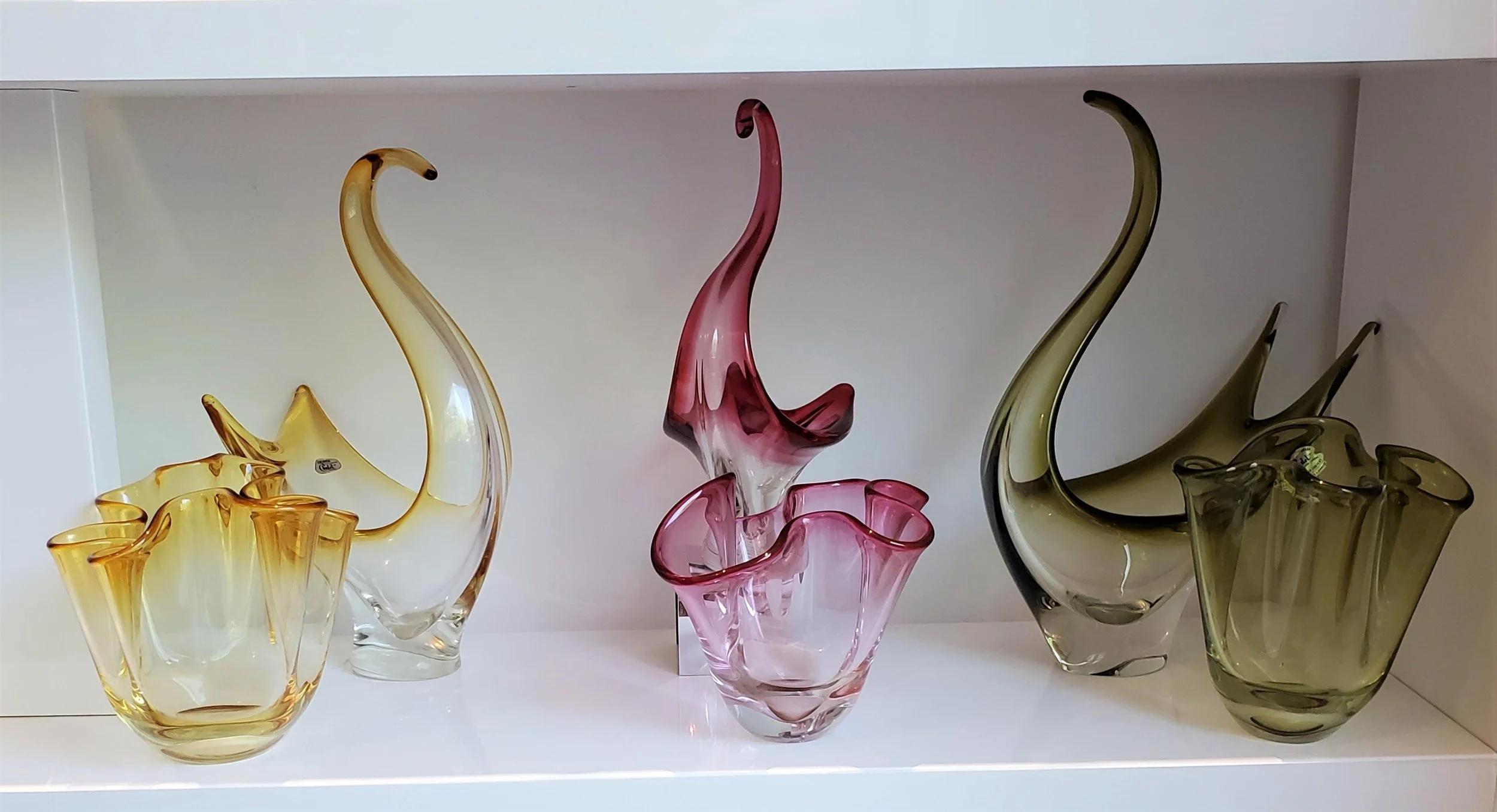
Regarding my glass, my favourite colour combination is olive green and sapphire blue pieces displayed together. I have had an olive green and sapphire blue display of one type or another for the last 10 years.
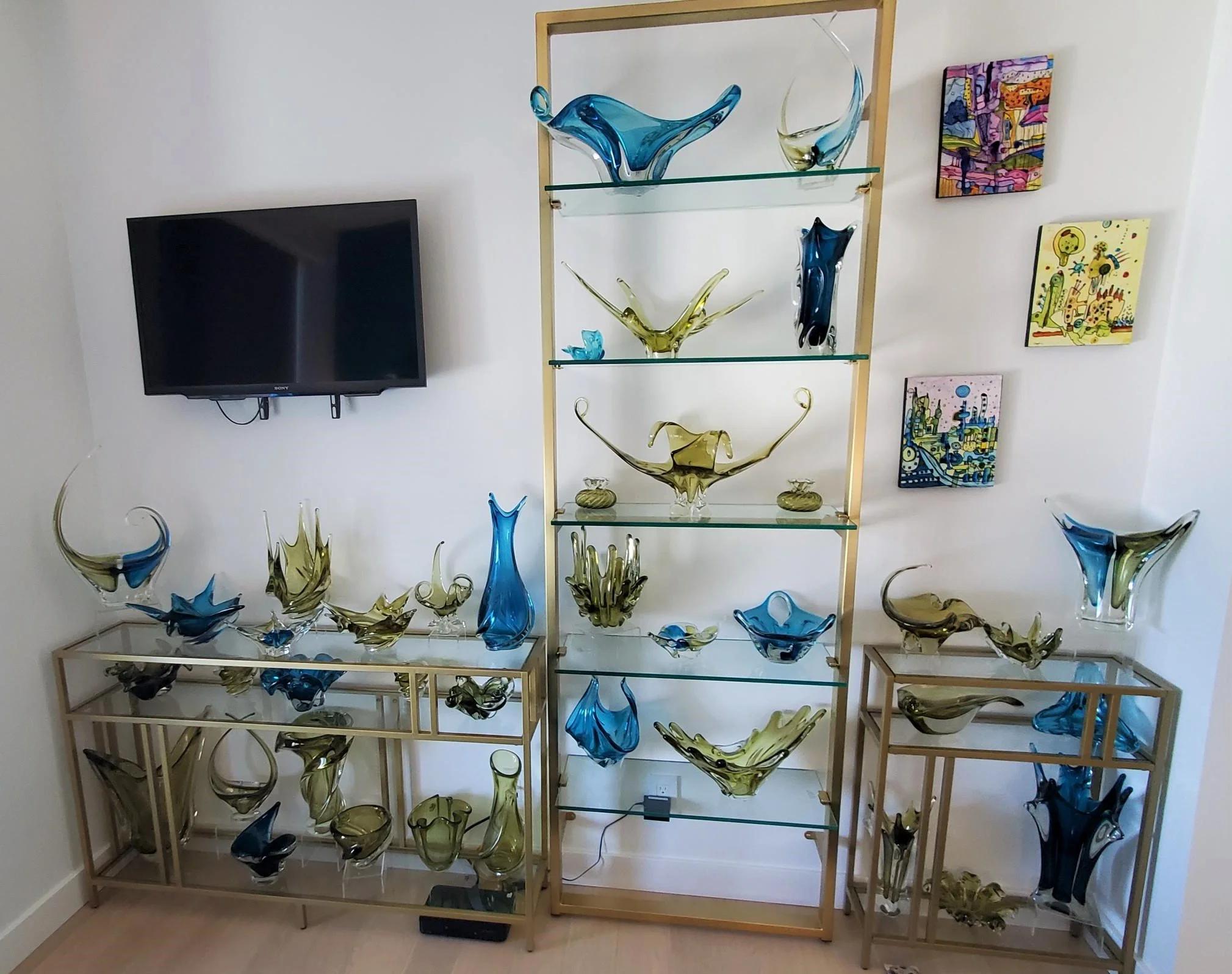
A past display.
The latest version:

A few recent groupings were determined by consistency of pieces in colour, design, and artist:
This first one, my Don Shepherd for Chalet display.

A Lorraine Glass Industries “chess piece” animal figurine grouping. Lorraine Maestro Mario Verna created these:


The small, simple shelves are size and style appropriate for both the physical space and the glass they display.
And I like to keep my EDAG bird centerpieces together. Here is one past grouping:
The “bird eggs” displayed are Chalet paperweights.
With moving, I have been able to show-case all (15 presently) together in my office in a few different groupings:

I love the colour and whimsey and energy these pieces bring to my workspace!
Various other collectors were also inspired to create some stunning displays by grouping “alikes” together:
A wall display of Lorraine Glass Industries vases by 50 Shades member Darlene Spence.
A grouping of rare Lorraine Glass Industries pieces.
Perfect showcasing of forms from the same line and the use of riser and plate stands certainly make the most of Colleen CG’s “real estate.”
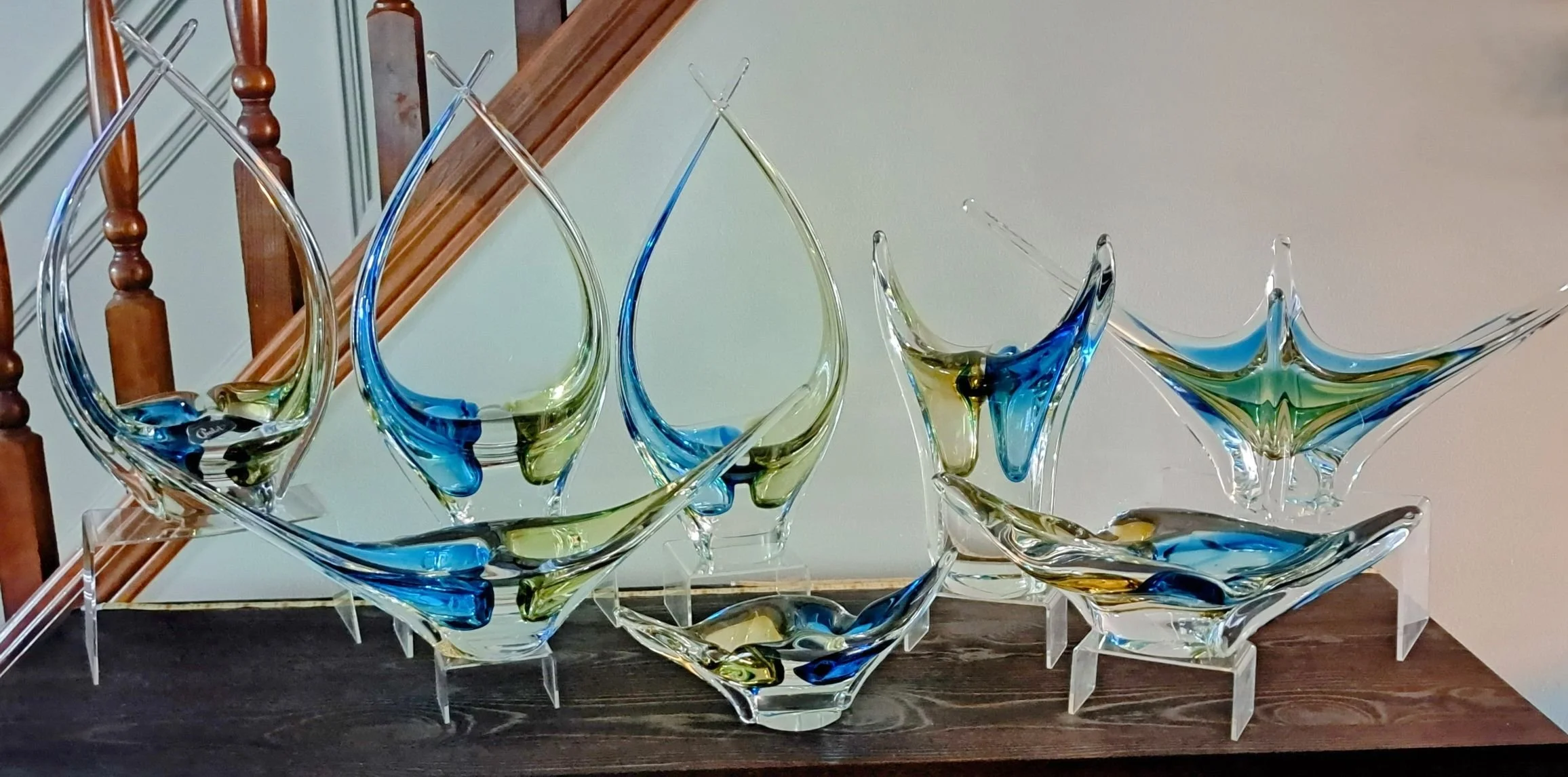
An impressive grouping of the rare Chalet olive/blue divided pieces by Cindy Bishop Laughlin.
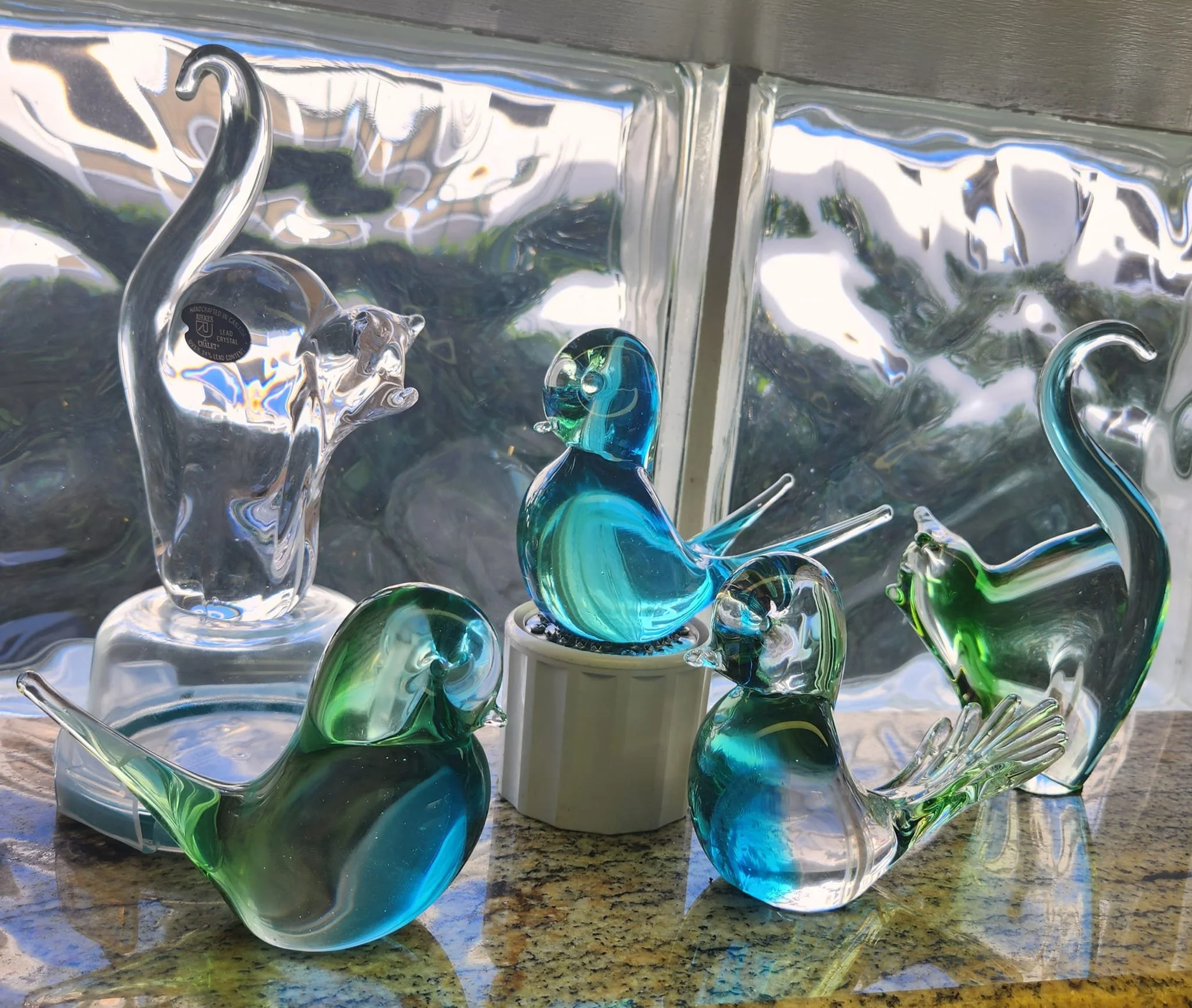
Susan Mitchell let loose her Chalet cats among her Chalet songbirds. Oh my!
Some very nice smaller groupings from Gionny Gueli:
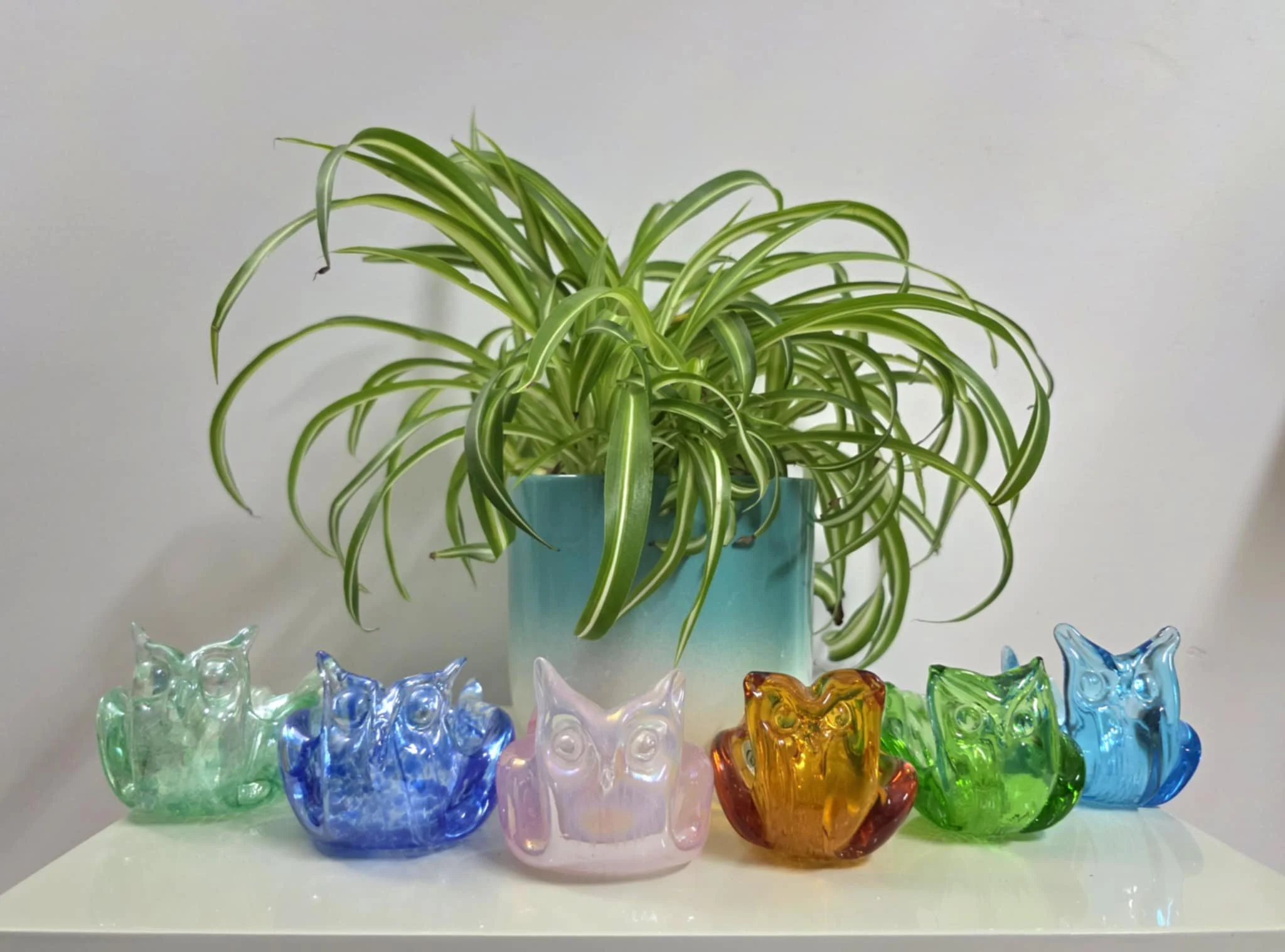
A selection of his Chalet owl bonboniere.
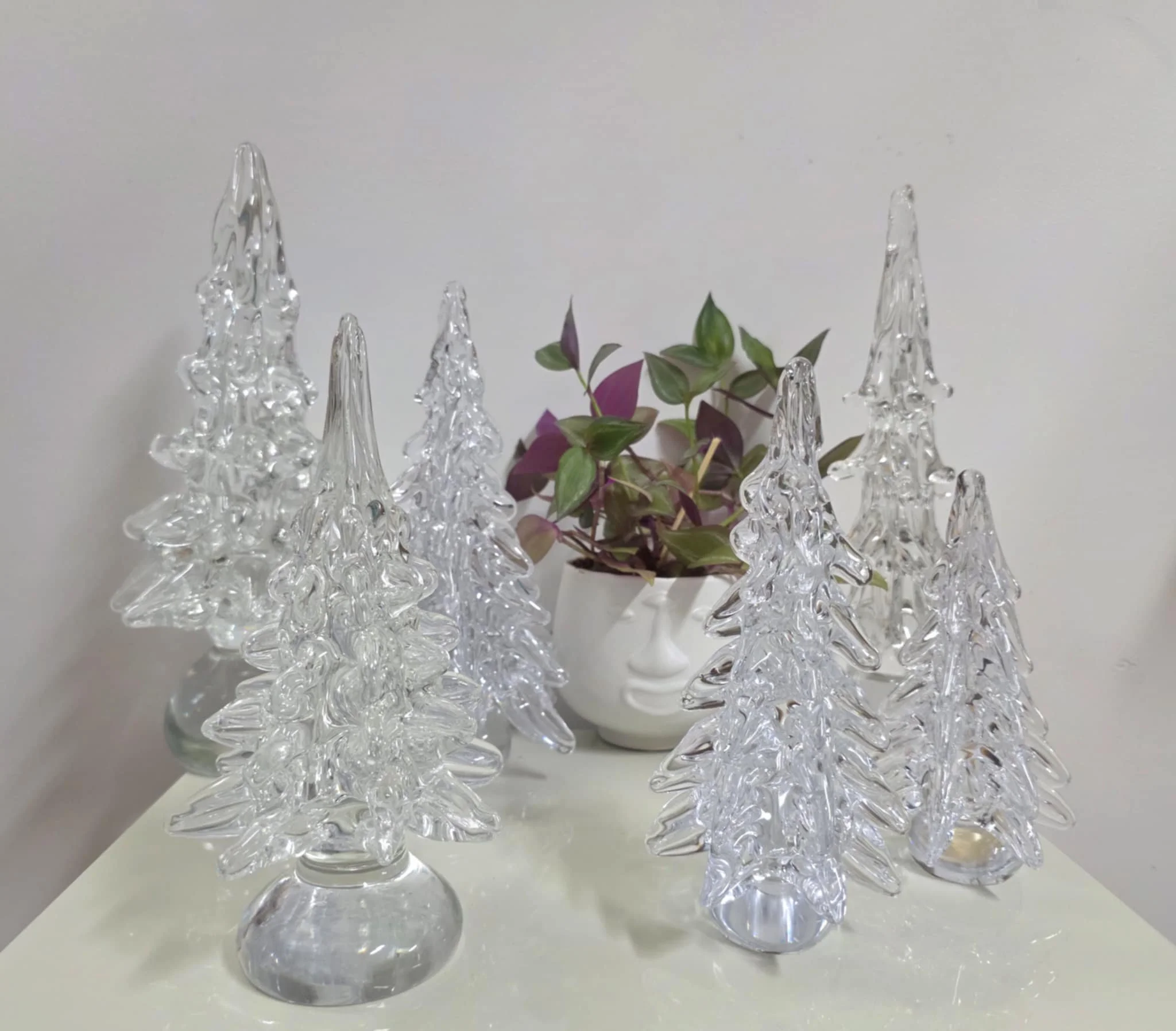
A few of his Chalet Christmas trees.
This Lorraine centerpiece style is one of Jeremiah Shaver’s favourite forms.

Collector Melissa Patterson has two favourites:
The Chalet cat figurines:

A Chalet “clowder.”
And pieces from the Chalet opal with raspberry splatter line:
Displays are often inspired by physical surroundings, art, specific pieces, nature…
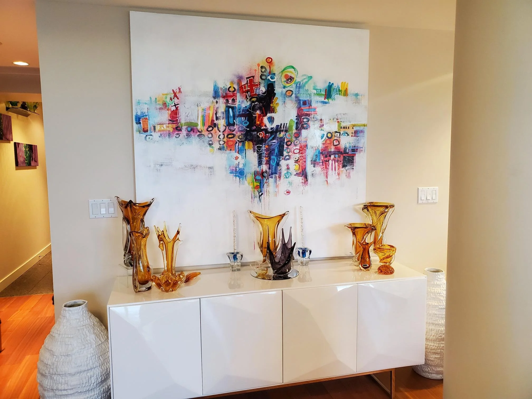
Since photographing these two baskets together, I have long wanted to do a display of amethyst and amber.

However, when doing new displays after moving, my purple pieces were all earmarked for another 2-colour display (shown below), so I contented myself with popping my amethyst “splash” in this amber grouping. You will note the sapphire blue candleholders as well. These 3 colours each reflect colours in the painting.
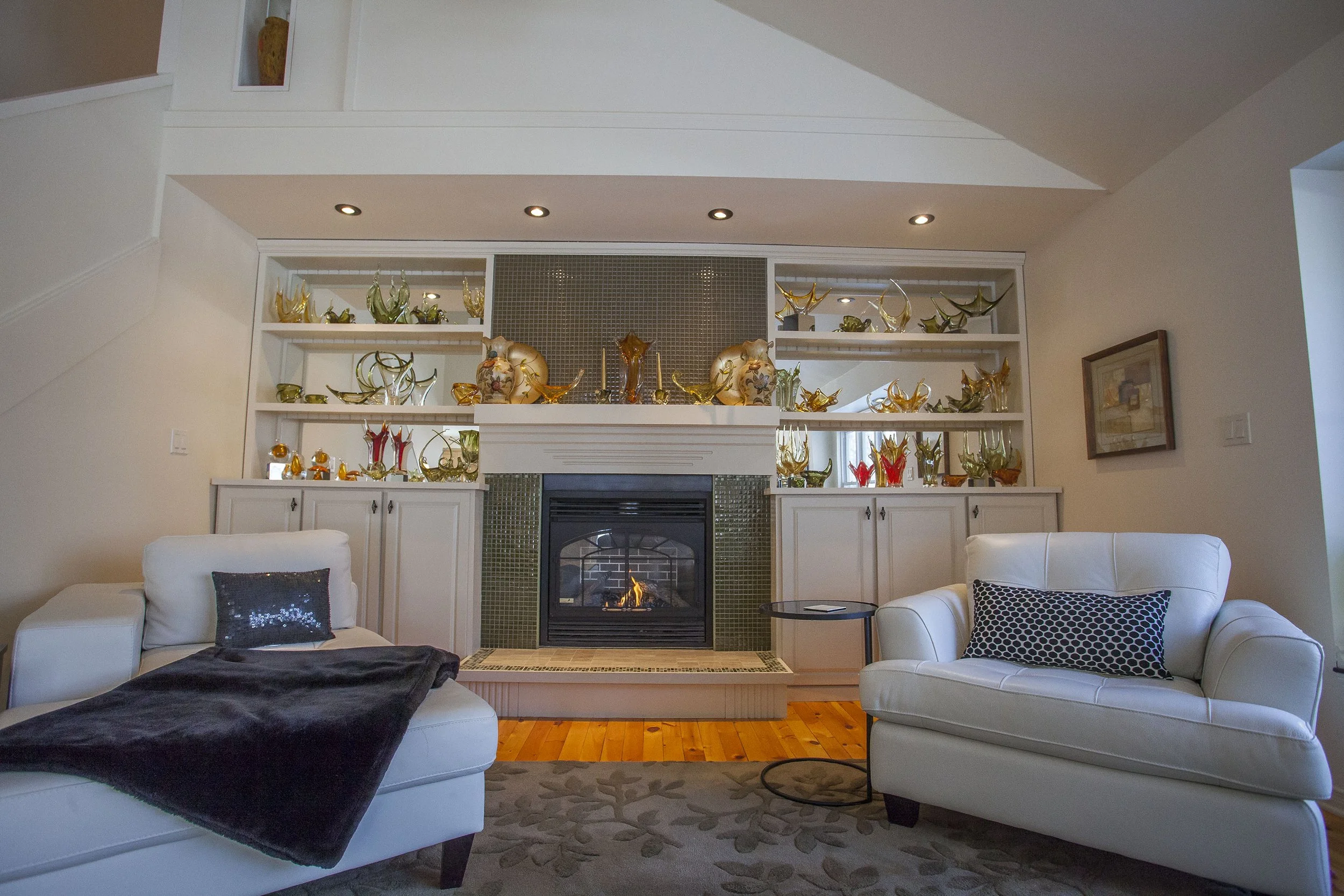
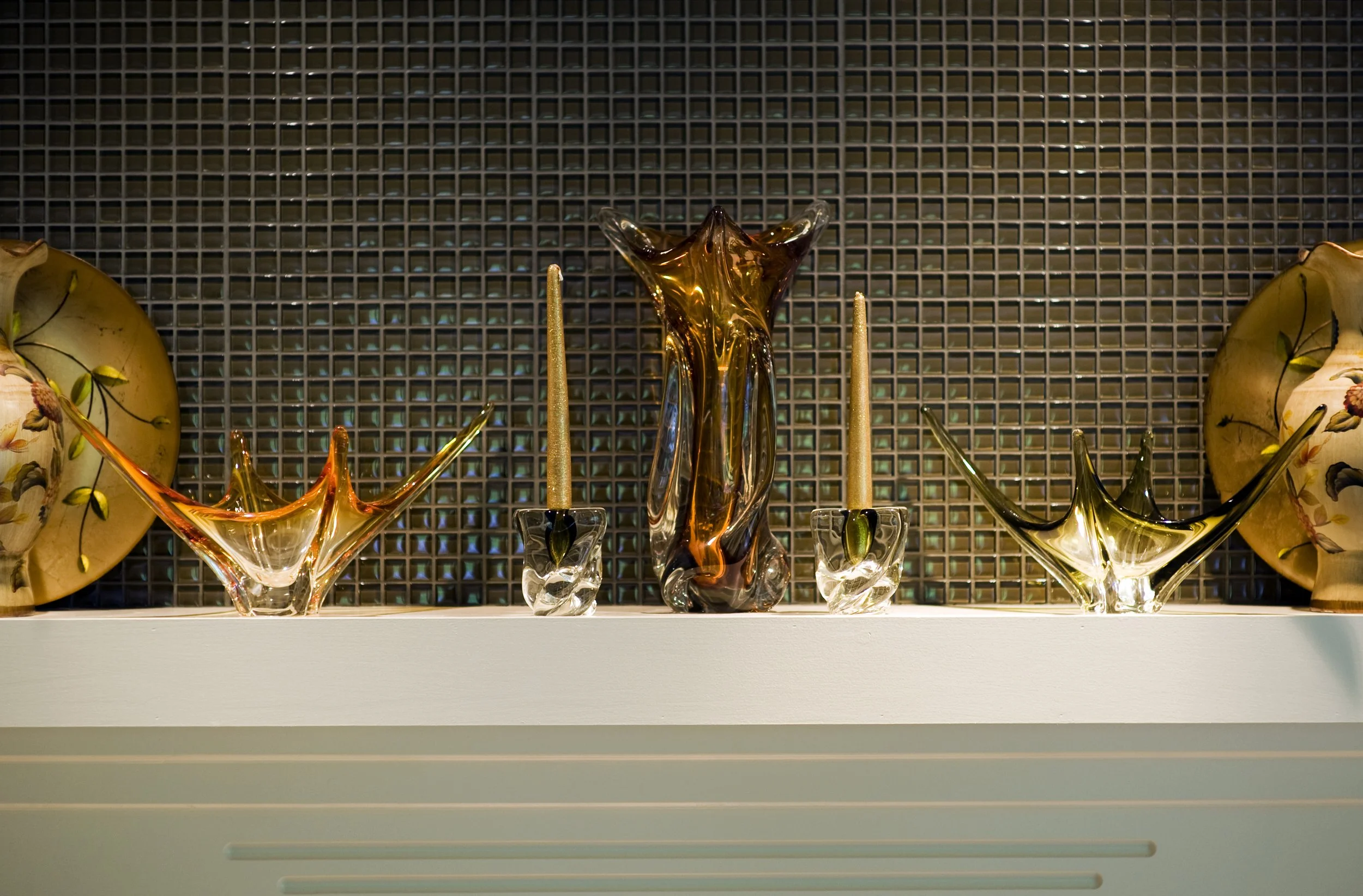
A fireplace is always a focal point. Therefore, pieces chosen to “dress” the mantle must be spot on. I took inspiration here from two things – the olive-green tiling of the surround and the over-mantle areas as well as the gold and green of the gorgeous charger plates flanking the display.
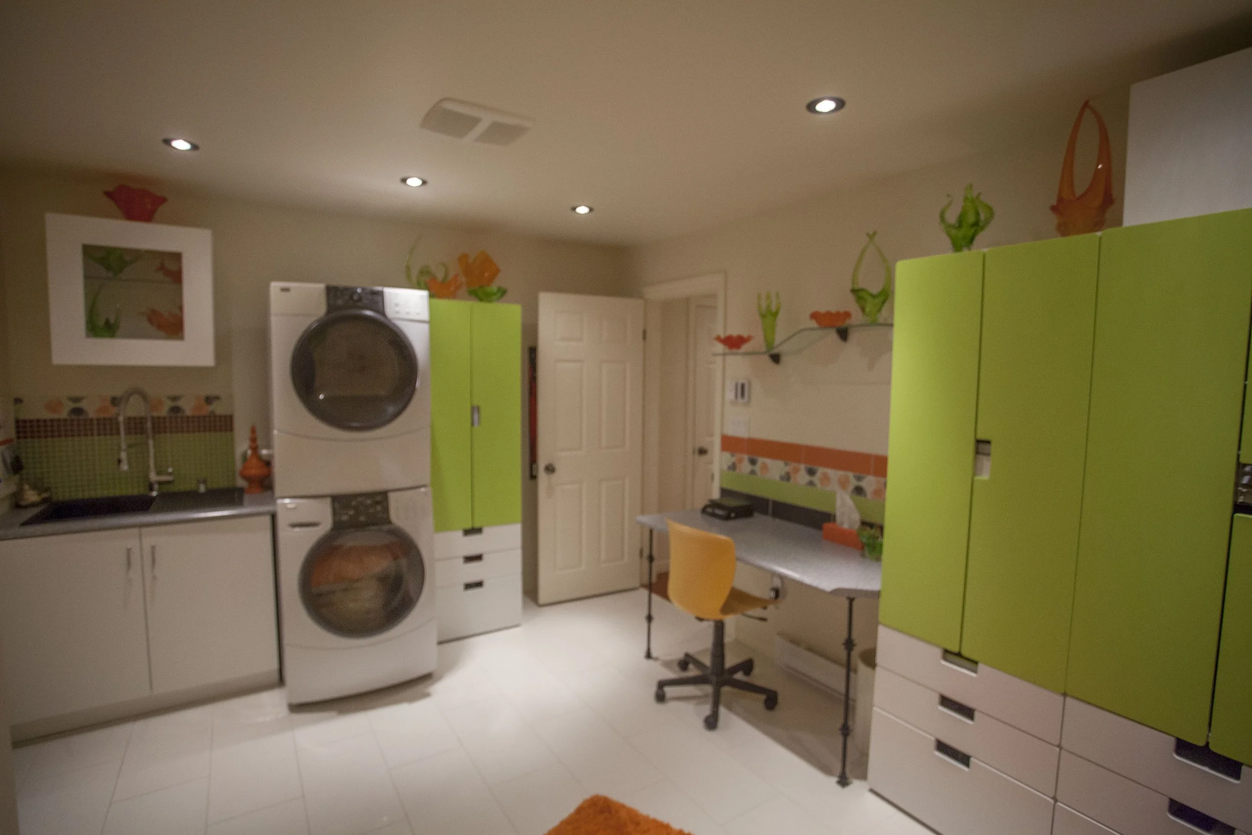
I fell in love with this kicky tile I used in my laundry /shipping room. It inspired the palette for both the storage cabinets and the displays.
Another colour inspired grouping. This small bedside display picks up the colour and fanciful motif of the wallpaper:
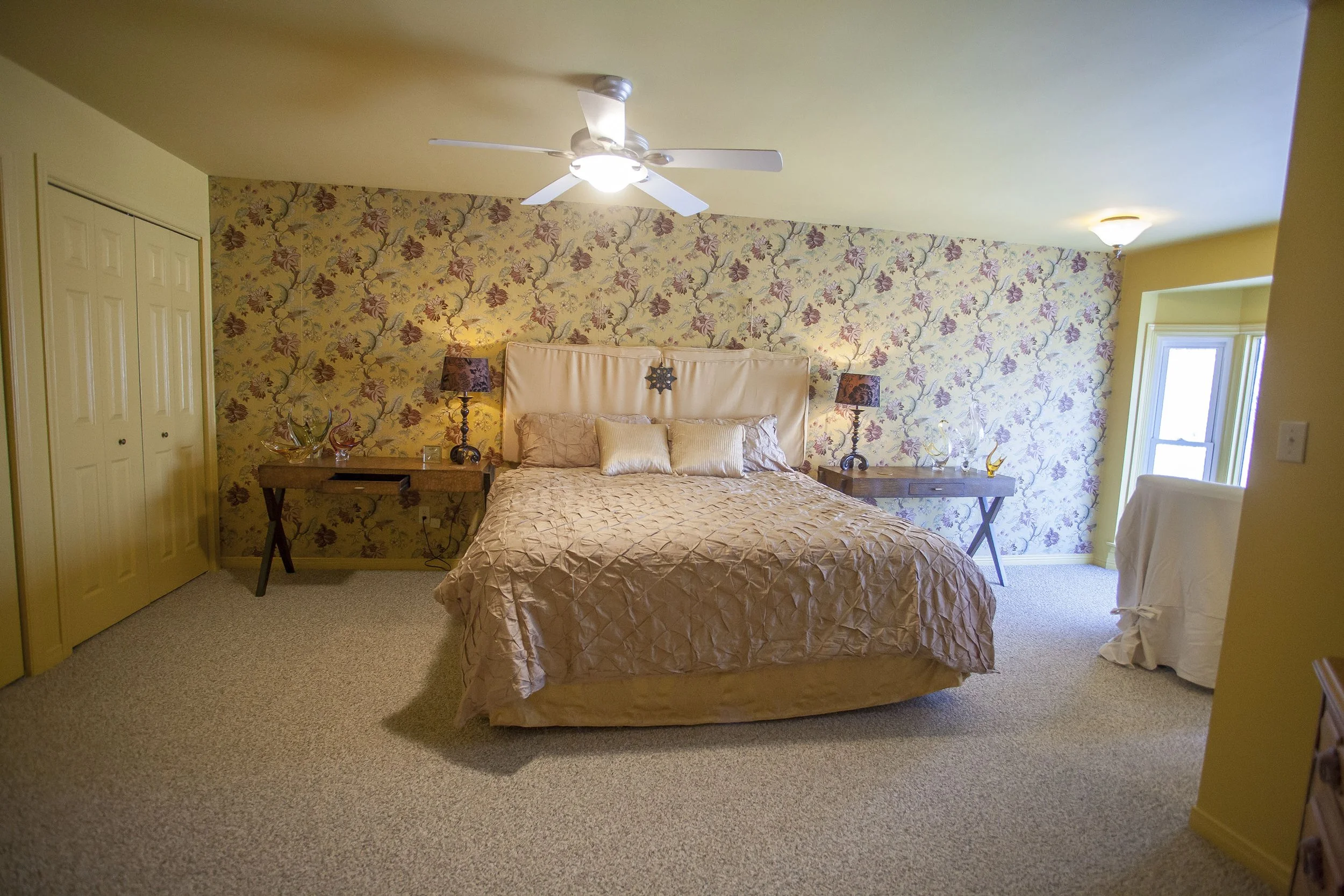

This display is a perfect balance re size, art and other collectables with the glass.

Superbly done by collector Kim Tersteeg.
Nature inspired displays.
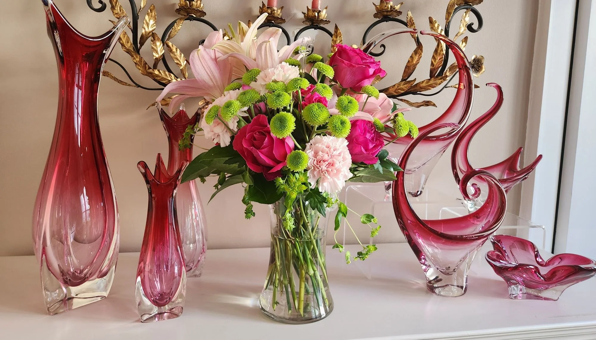
When a beautiful bouquet of flowers arrives:

Cindy Bishop Laughlin.
Susan Mitchell.

Melanie Brown Daniels.
Every so often, your glass not only works as a display but it performs a practical function as well:
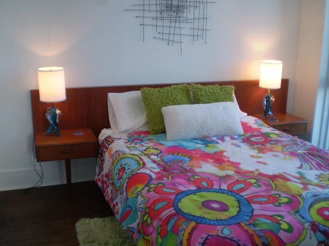
Form and function together. Loved my mid-century modern bedroom. Condo living meant downsizing in size but not style!
Displays incorporating other collectables with the glass.This display by collector Karen Jordan is simply fantastic!
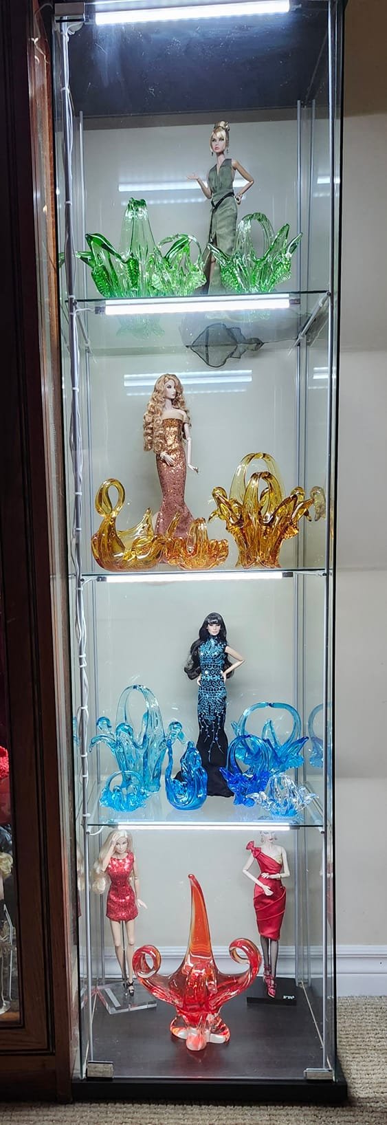
All dolled up!
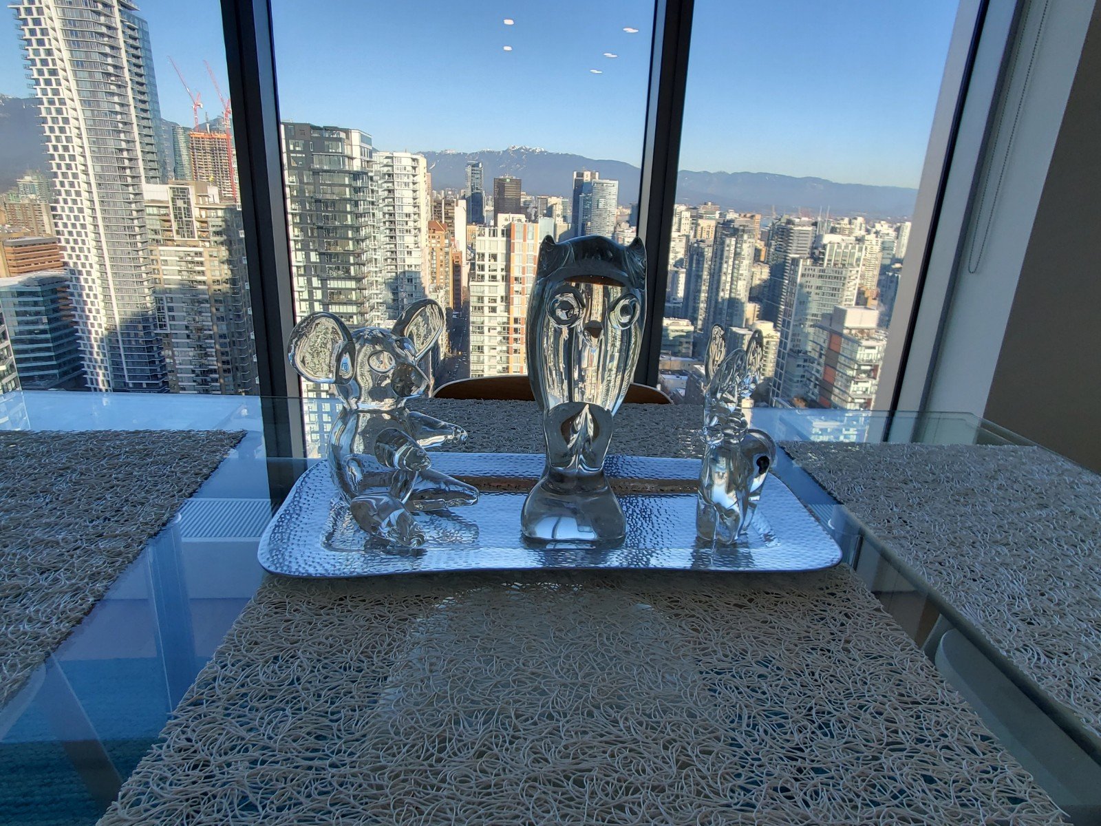
I love how Marc Linder accents his Chalet rabbit figurines.

A cherished piece of heirloom furniture is given additional “gravitas” by its adornment:

Alex Wicks.
Physical space restraints, or lack thereof, also play a crucial factor.
Dining room table displays are by necessity typically contained and restrained. Themed arrangements usually work best:

Courtesy of Lise Legare-Kowalchuk.

This table display by Lori Hazuka Morin.
3 amigos. From the collection of Deborah Patterson.
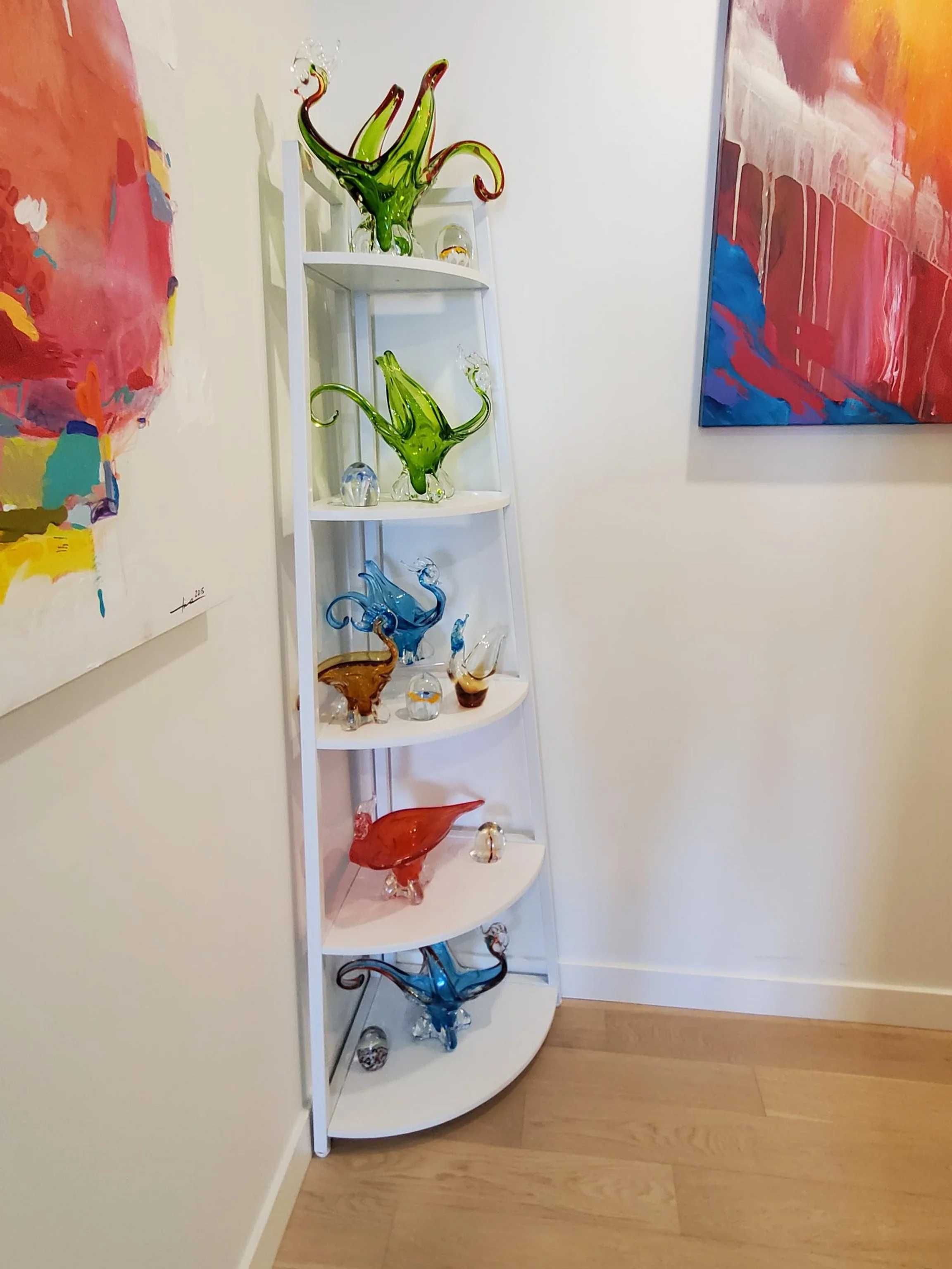
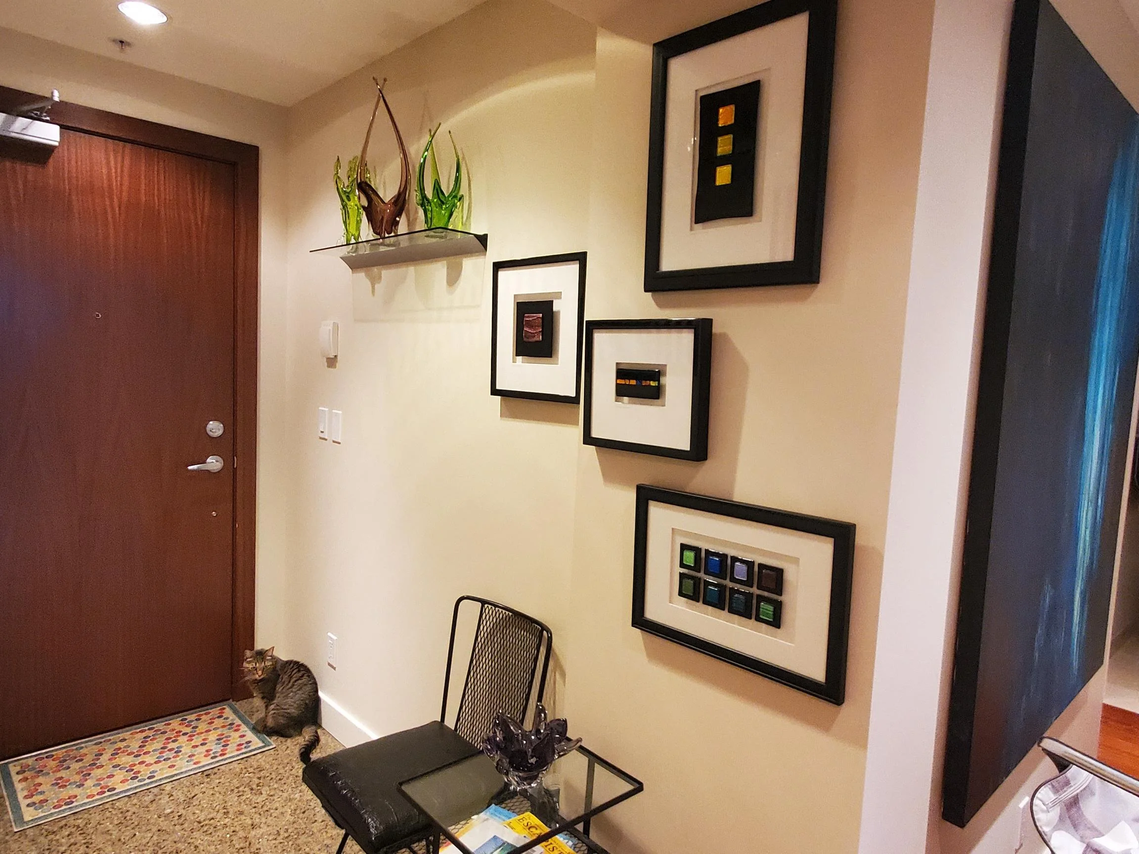
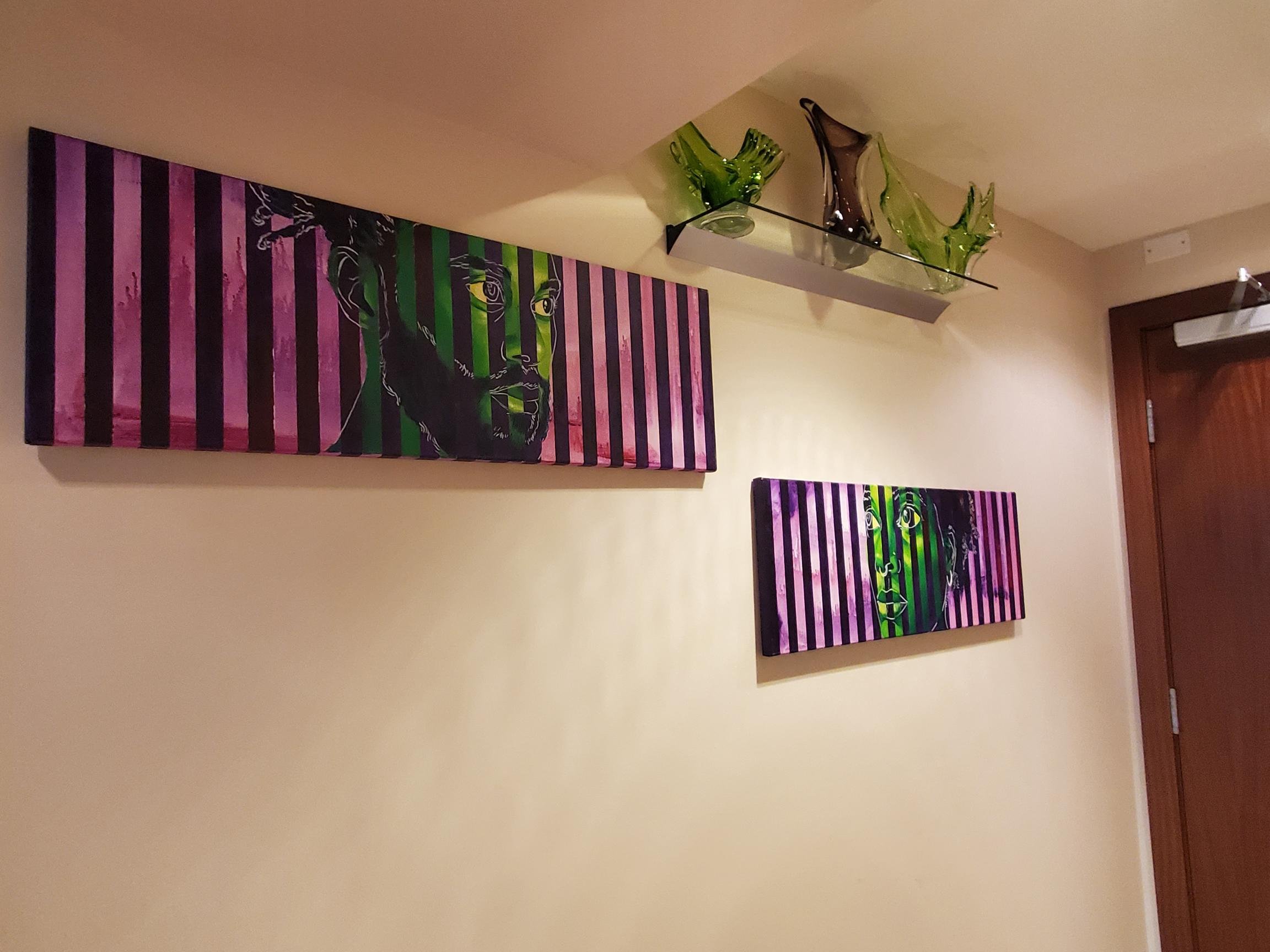
Sometimes a little hallway nook and cranny can benefit from a small-scale accent:

Painting is only 8x10” with small (12”), narrow (5”) shelf underneath. The monochrome colour palette of both painting and glass also work well not to overwhelm this tiny alcove.
Sneaking in a corner display. Obviously, the right shelf plays a huge role here.

Large areas demand large displays!

Display by Colleen CG.
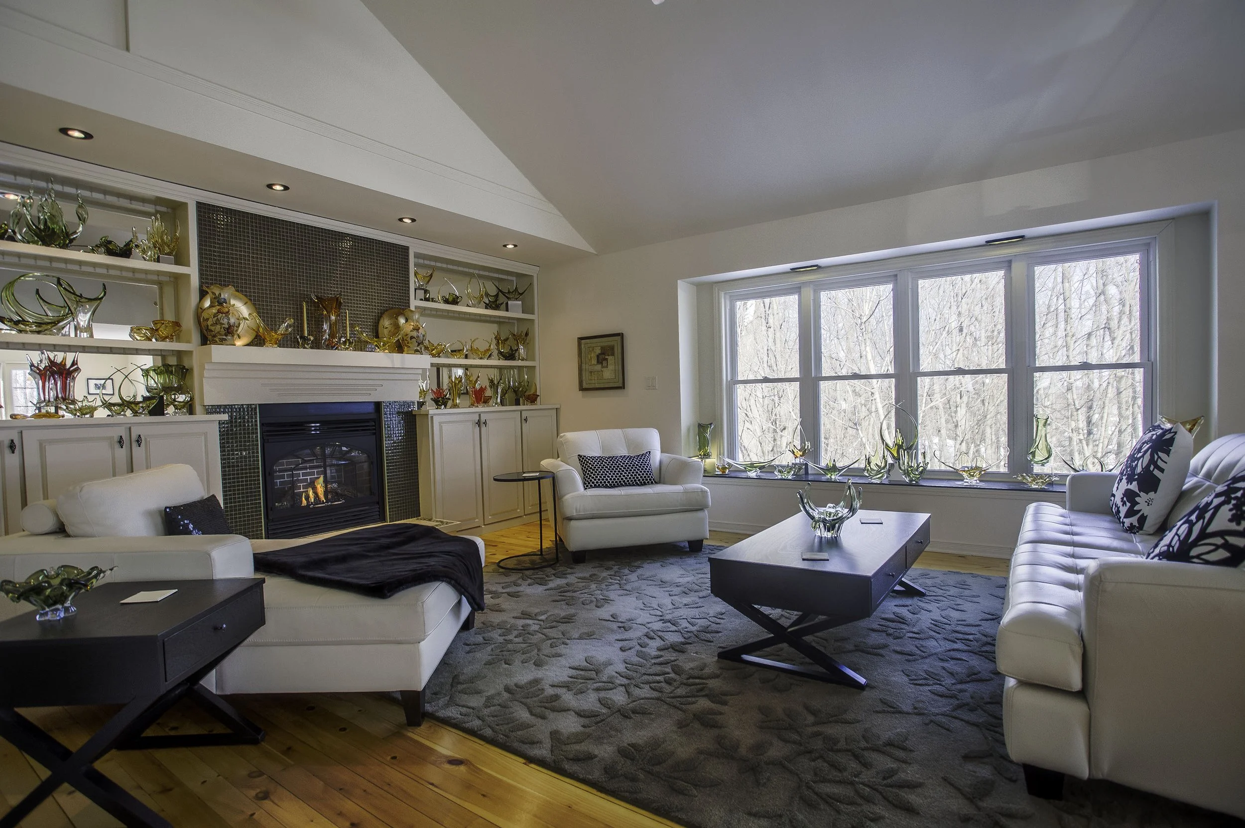
My living room displays before downsizing from a house in a small city country subdivision to big city downtown condo life.
Single piece displays.
The glass not only must be a striking piece but the art and accents chosen to highlight must be so as well.
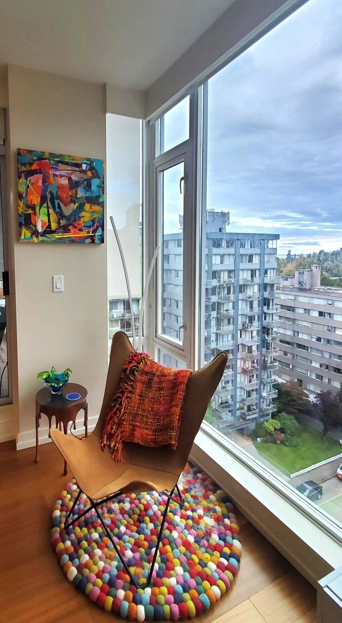
The painting, the copper table, the suede chair, the mult-coloured rug and afghan all work together with this 2-tone EDAG ashtray to create high impact. Nothing like colour!

Daniel Lynch has created a perfect vignette through eye-catching shapes, textures and colours. All the elements here just work together so well.
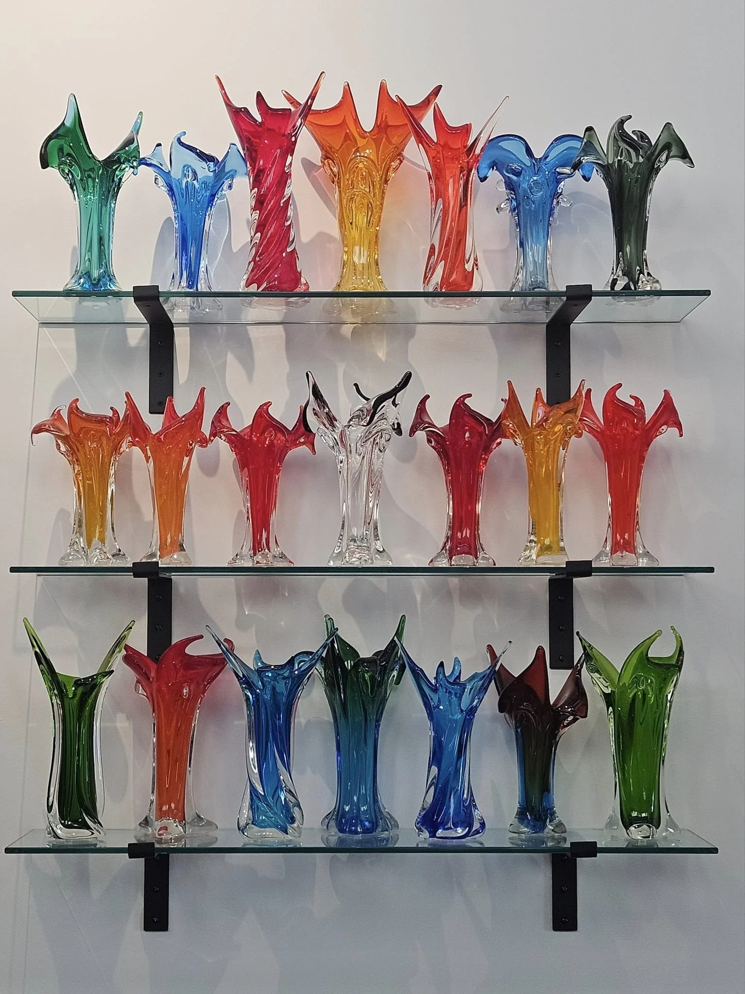
Single colour displays.
Balance and forms that work well together is especially important in a single colour grouping. So is the use of display risers to give the eye a break and give focus points within the display. Adding accent lighting, art, photographs etc. also will enhance the pieces chosen.

Display by Ella Hanks. Note the ironwork “Birdman” sculpture by American artist Kurt Runstadler at left. It enhances the display through both contrat and compliment - contrasting by providing a break in form and complimenting the framework of the display unit.
A smaller single colour grouping. Showcased art and Chalet from the collection of Karen Jones.

Picture perfect!

A two-colour display can either compliment or contrast.
Complimentary colours:

With this showcasing, it is obvious that Jeremiah Shaver has mastered the 2-colour tone on tone display!
Complimentary shapes in contrasting colours:

Moored in the harbour of Cindy Bishop Laughlin.

From the collection of Deborah Patterson.
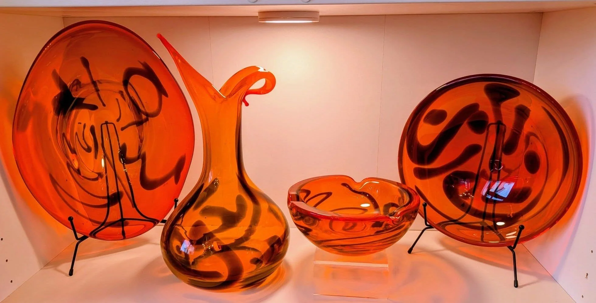
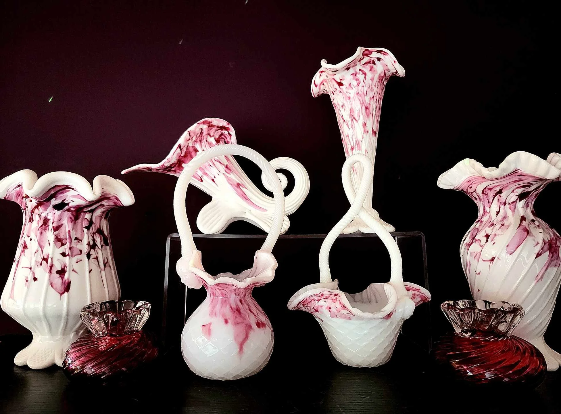
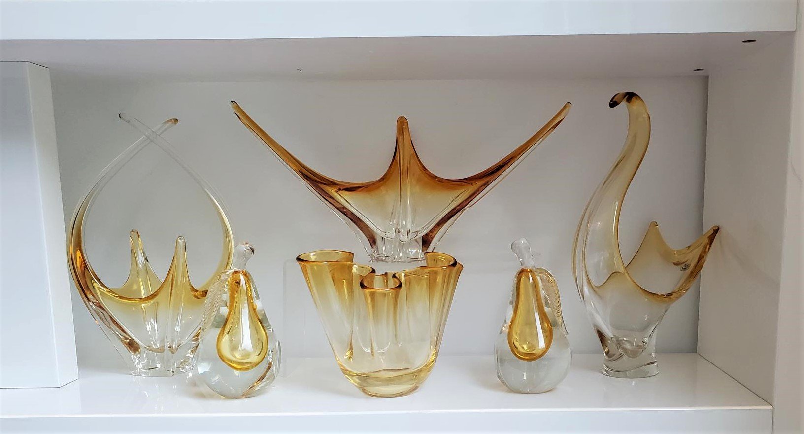
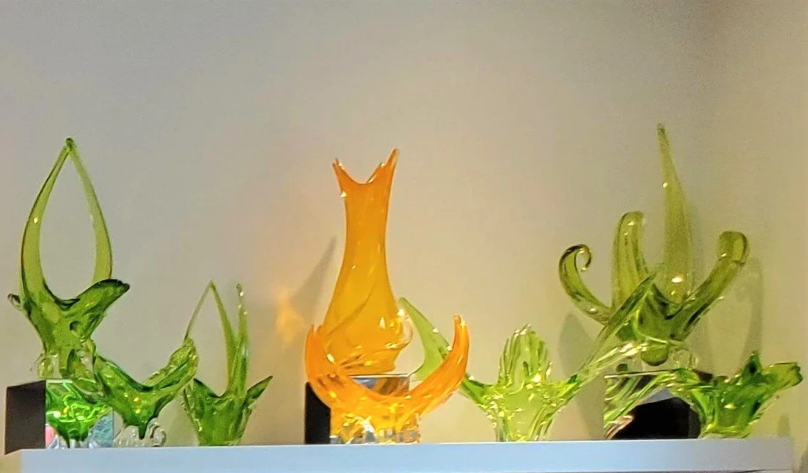
Sharp contrast colour. Colour selection here is driven purely by personal preference. A few of mine over the years:
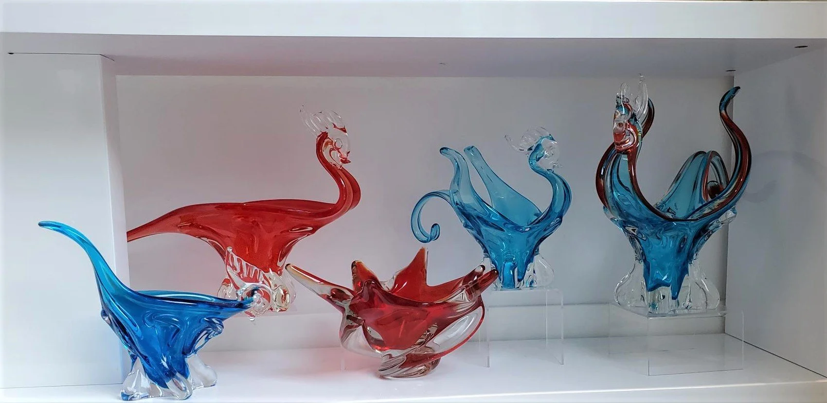
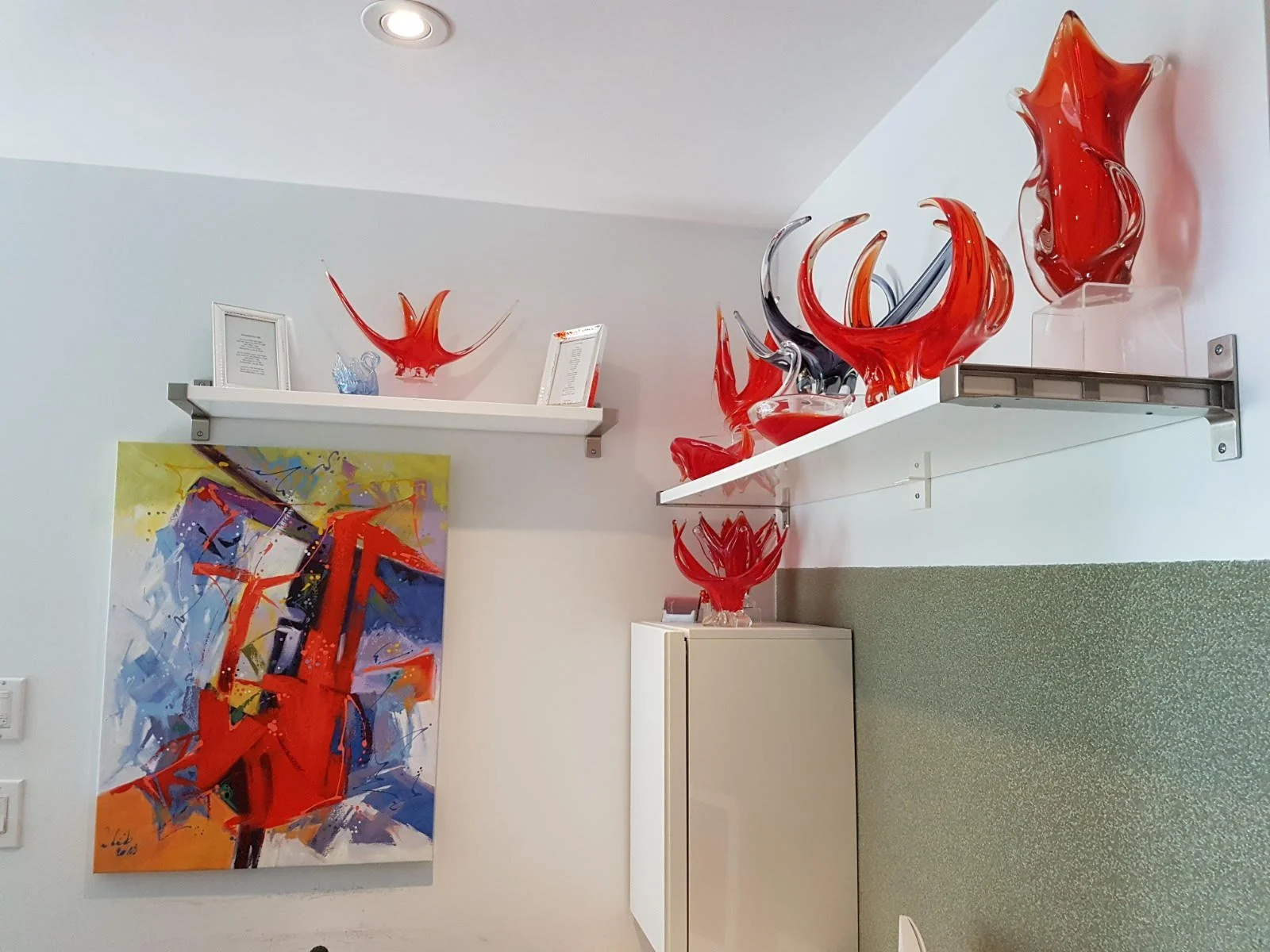
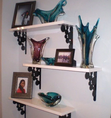

Our entry way cannot be described as nondescript!
The cat is neither stuffed or glass - just super nosey!
A 3-colour display can be a little tricky.
I tend to keep mine simpler – same shape but in contrasting colours.
2 versions I tried. I decided upon this one.


However, I do also like different colours and different forms together but find a repetition of colour and scale, and same style shelving within the display works best for me. Except for the “ice” uranium “fingertip” vase, these are all smaller pieces. With the use of risers, all fit on these 10”x 10” shelves.

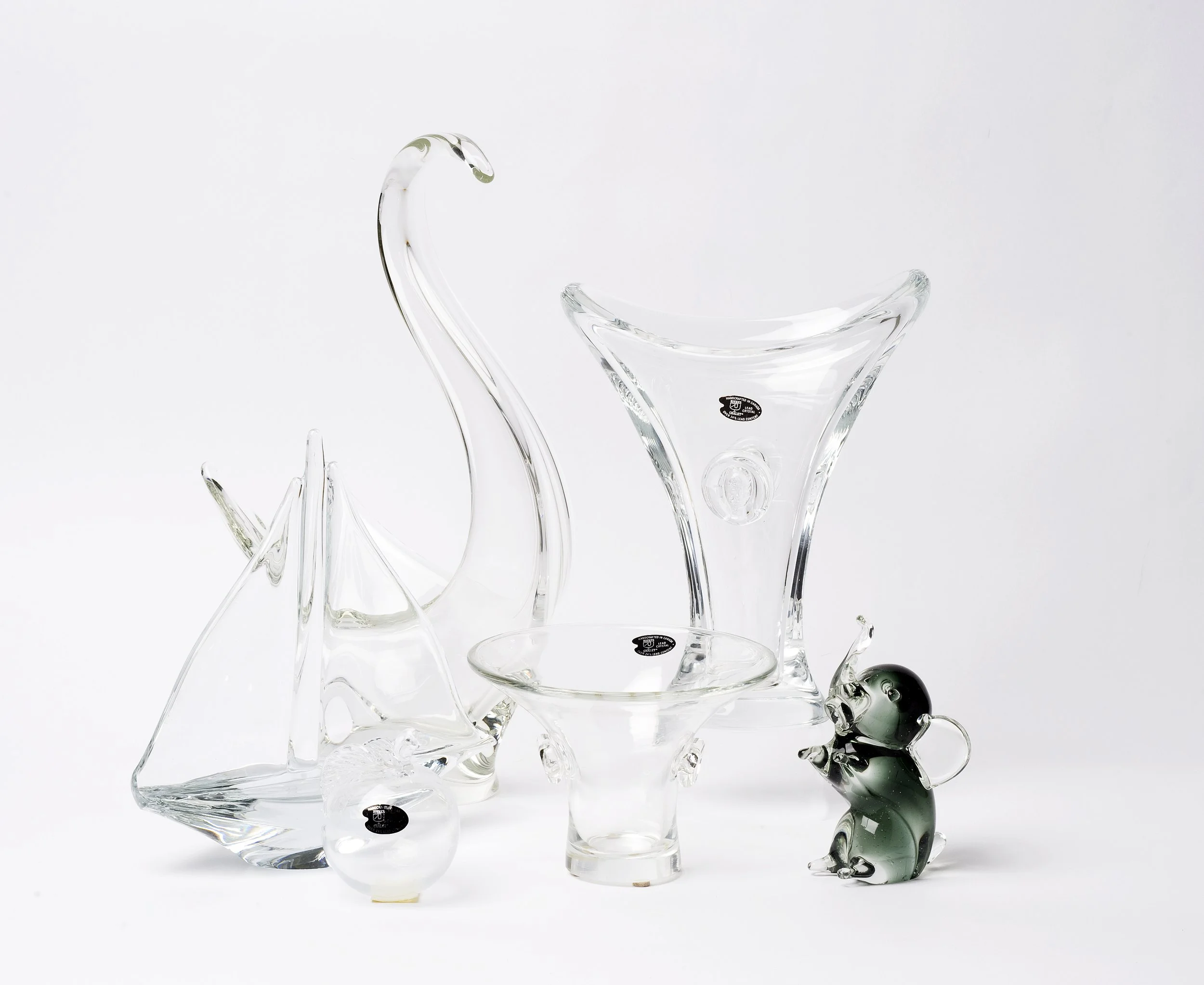
Clear crystal pieces can be difficult to display.
Using mirrors underneath, art or a coloured background wall or popping in a single piece of coloured glass can help define and emphasize.

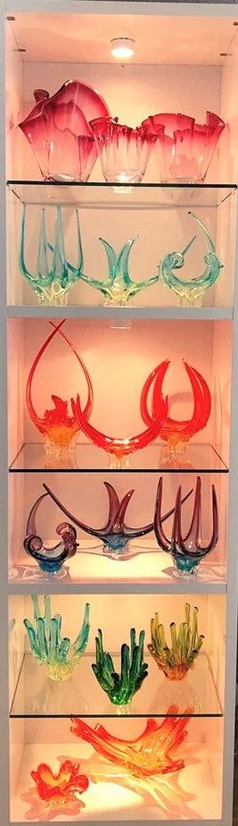
Multi-colour displays are the most difficult for me personally to get right.
The pieces in this display were selected to compliment the adjacent wallpaper and art incorporated within the display. I am not sure if I am 100% satisfied yet. As well as 5 pieces of art, there are many different shapes and colours so, I kept the shelving consistent.

A very striking multi-coloured display by Pierre Denis.
Although 17 pieces are highlighted – 11 different forms and in differing 6 high contrast colours, it “reads” as elegant and unified.
The best way to see what displays you are most happy with is to just do it! And – creating new displays and/or fine-tuning existing provides a bonus – your glass gets cleaned!
Love to see, “What’s in your display.”Since I showed you mine - you have to show yours!